Stimson Advisory
At Masters Agency, we understand that a brand’s identity should reflect the passions and values of its founders. When rebranding Stimson Advisory, formerly Stimson Urban & Regional Planning, we drew inspiration from the owner’s love for travel across both urban and regional landscapes.
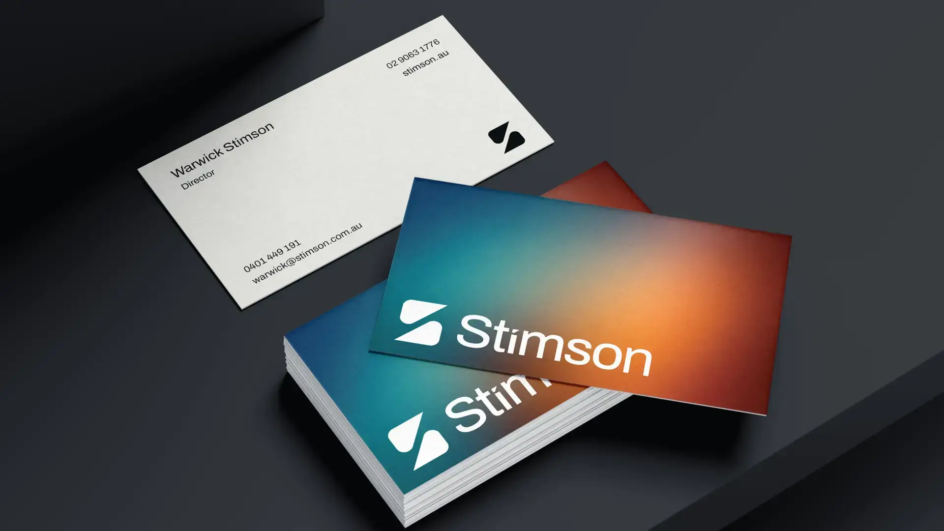
This influence is beautifully captured in the new colour palette, which features vibrant blues and rich oranges.
The dynamic blue hues symbolise the energy and innovation found in bustling urban environments, reflecting Stimson Advisory’s commitment to forward-thinking solutions in city planning. In contrast, the deep, burnt orange hues evoke the rugged beauty of the Australian desert, representing the firm’s dedication to sustainable and thoughtful regional development. Together, these colours create a harmonious balance, embodying the diverse expertise and vision of Stimson Advisory.
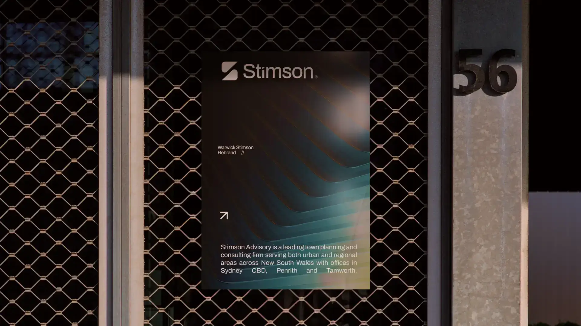
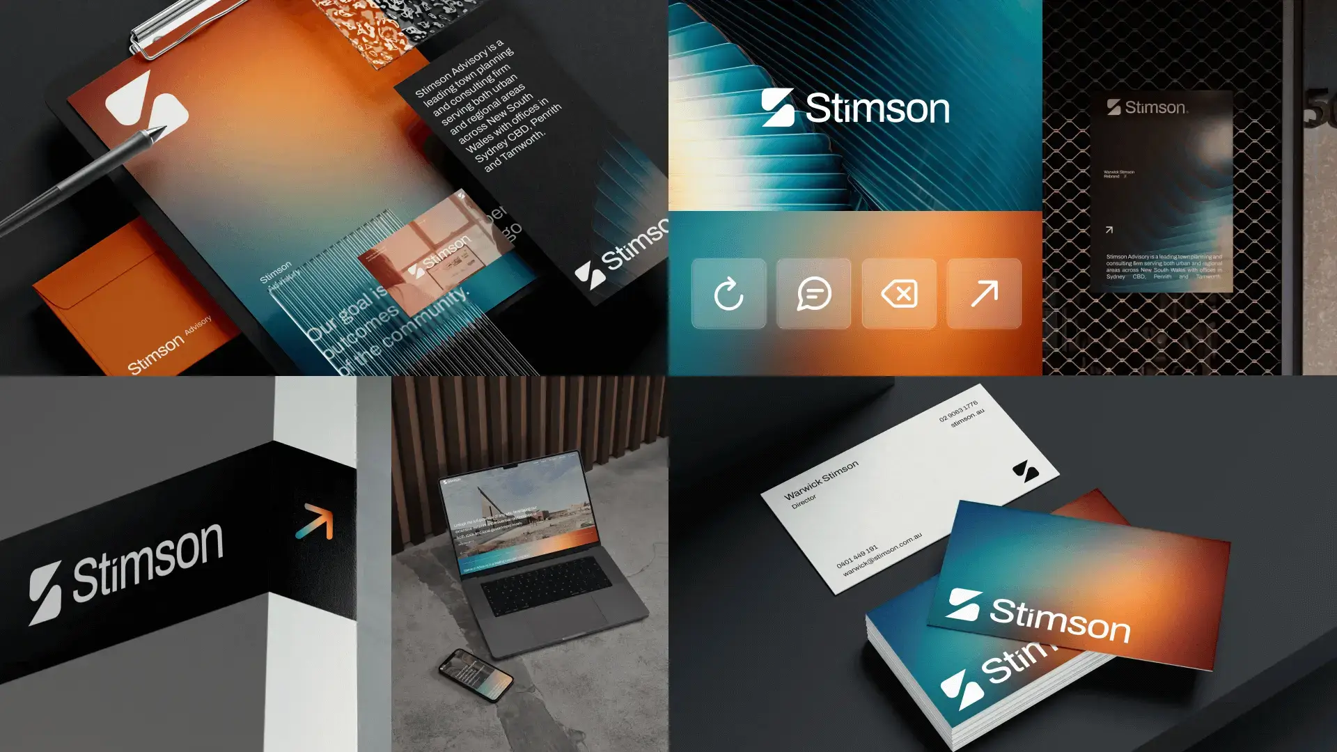
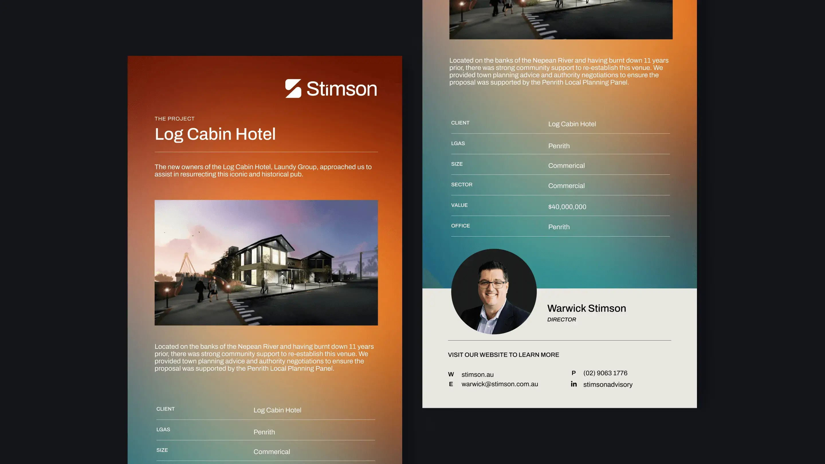
Our comprehensive rebranding efforts for Stimson Advisory included a complete overhaul of their brand identity. From the inception of a new, impactful name to the meticulous crafting of their brand image, Masters executed every detail with precision and creativity. We redesigned the Stimson Advisory website to reflect modern aesthetics and enhanced user experience, ensuring seamless navigation and engaging content. Additionally, we transformed their document design, integrating their new brand elements to create cohesive and professional materials.
Masters Agency’s holistic approach to rebranding has empowered Stimson Advisory to present a strong, consistent image across all platforms, setting them up for continued success.


.svg)